I no longer update on this site, but to see my recent work visit:
Portfolio website
facebook fan page
Tumblr
Monday, March 24, 2014
Wednesday, February 16, 2011
Set Dressing Map UDK
Wednesday, February 2, 2011
Annie_head Updated
I ended up modeling the geometry for the hair and added a quick shader to it for a placeholder. Later I'll texture the hair and zbrush the whole head. Most importantly though I fiddled...
Using the quick and dirty crazybump program, I made a couple maps to plug into the various locations in the shader. The outcome? A great start to a beautiful addiction. I have never added anything other than bump maps and textures to my models. Specular, Occlusion, Normal, and Color maps were added and so far it has given it a more life like appearance. I had fun doing it and learned much. I'll continue working on this, after I do some kismet in UDK :)
Happy Time :)....:
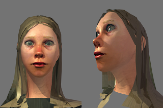
WIP:

Polygon Mesh w/tris:
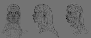
Using the quick and dirty crazybump program, I made a couple maps to plug into the various locations in the shader. The outcome? A great start to a beautiful addiction. I have never added anything other than bump maps and textures to my models. Specular, Occlusion, Normal, and Color maps were added and so far it has given it a more life like appearance. I had fun doing it and learned much. I'll continue working on this, after I do some kismet in UDK :)
Happy Time :)....:

WIP:

Polygon Mesh w/tris:

Tuesday, February 1, 2011
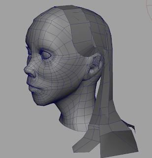
Annie_head
I quick preview of a side project. This is a practice on edge loops and modeling in general. This is geared more towards the animation side of my life due to the greater number of polys. However, reducing the poly count would prove beneficial in the long run because I could eventually attach a bone structure and possibly pop this sucker into unreal and see what I can learn. Regardless, I'll finish up the hair and UVs...sometime.


Monday, November 29, 2010
Sketch a roo
Saturday, November 13, 2010
test_all
Here is a quick render of the scene so far. There are some major things wrong here, most prevalent being the waterfalls(stupid particles...no stupid me for not figuring them out), no bg, and the ground being too smooth even with the texture.
Still I dont mind the lighting, defiantly will tweak it by the due date on thurs-no...yeah, This Thursday....shit thats really soon. Well I'll be a zombie by Friday for sure, sweeeeeeeeeeeeet.
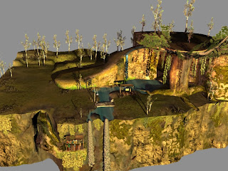
Still I dont mind the lighting, defiantly will tweak it by the due date on thurs-no...yeah, This Thursday....shit thats really soon. Well I'll be a zombie by Friday for sure, sweeeeeeeeeeeeet.

Tuesday, November 2, 2010
arrangement
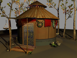
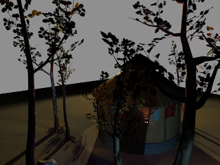
So here is a nice little arrangement of some of my assets mixed with a second version on my yurt. Assets are: tree,tree2, torch,fern, rock1, rock2,flower, and yurt2. I used various numbers of each asset to get a look that I want. Here though, are some dramatic lighting shots, one is a back view in the shadow, and the other is with the rising "sun" hitting it so its bright. Shadows need a little work. Enjoy


Tuesday, October 19, 2010
Thursday, October 14, 2010
Wednesday, October 13, 2010
Asset Lantern/Torch
Thursday, October 7, 2010
thats about it
I've started working on my model of my head again. Just finishing up some touchups of uvs. Later I'll add hair and eyes to make it less spooky. For class tho I have at least 5 assets due by next week. Yay level design!
Wednesday, October 6, 2010
Old works pt4
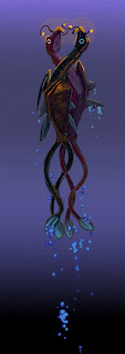
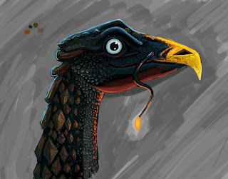
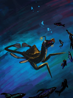
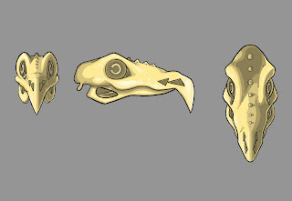
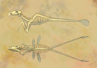
One of the most rewarding experiences at SCAD has been during my Animal Anatomy class. In it, we had to make a complete musculature out of Plasticine on a bone structure of a cat. Also we had to create an animal that catered to whatever world we designed, be it real or not. My Professor Paul Hudson is a man of many talents being part of Imagineers at Disney, NASA, FBI for facial reconstruction from a skull, and various museums so he could create awesome dinosaurs. Therefore, creating a creature that could be opaque enough that an individual such as he could not see through easily was a challenge, but I oh my did I enjoy it! It wasn't just the visuals that had to sell my creature, but the history, how it moved, how it ate, what animal class it was in, ect. The more detail the better.
Below is a copy of my animal information:
LINK
Old works pt3
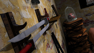
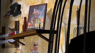
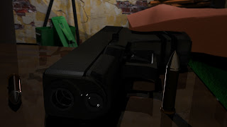
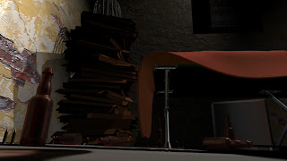
I had to create a scene or environment for a character and this place must be from my imagination. So of course who would I choose? Why the leading Merc with a mouth of course, DEADPOOL.
I really just had fun modeling for the camera and also learning procedural texturing in maya. Hope you all like and long live the Deadpool :)
Subscribe to:
Comments (Atom)


